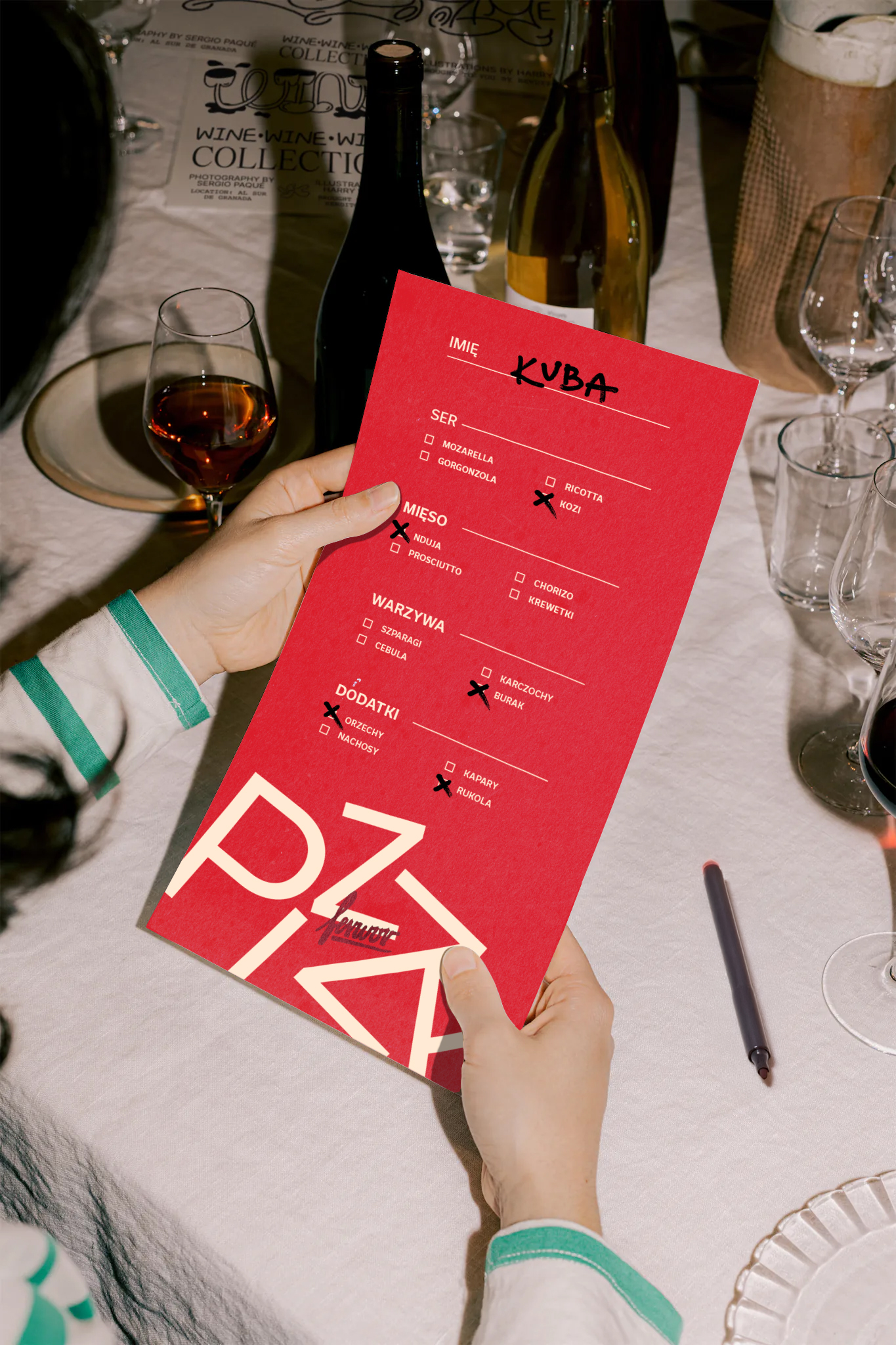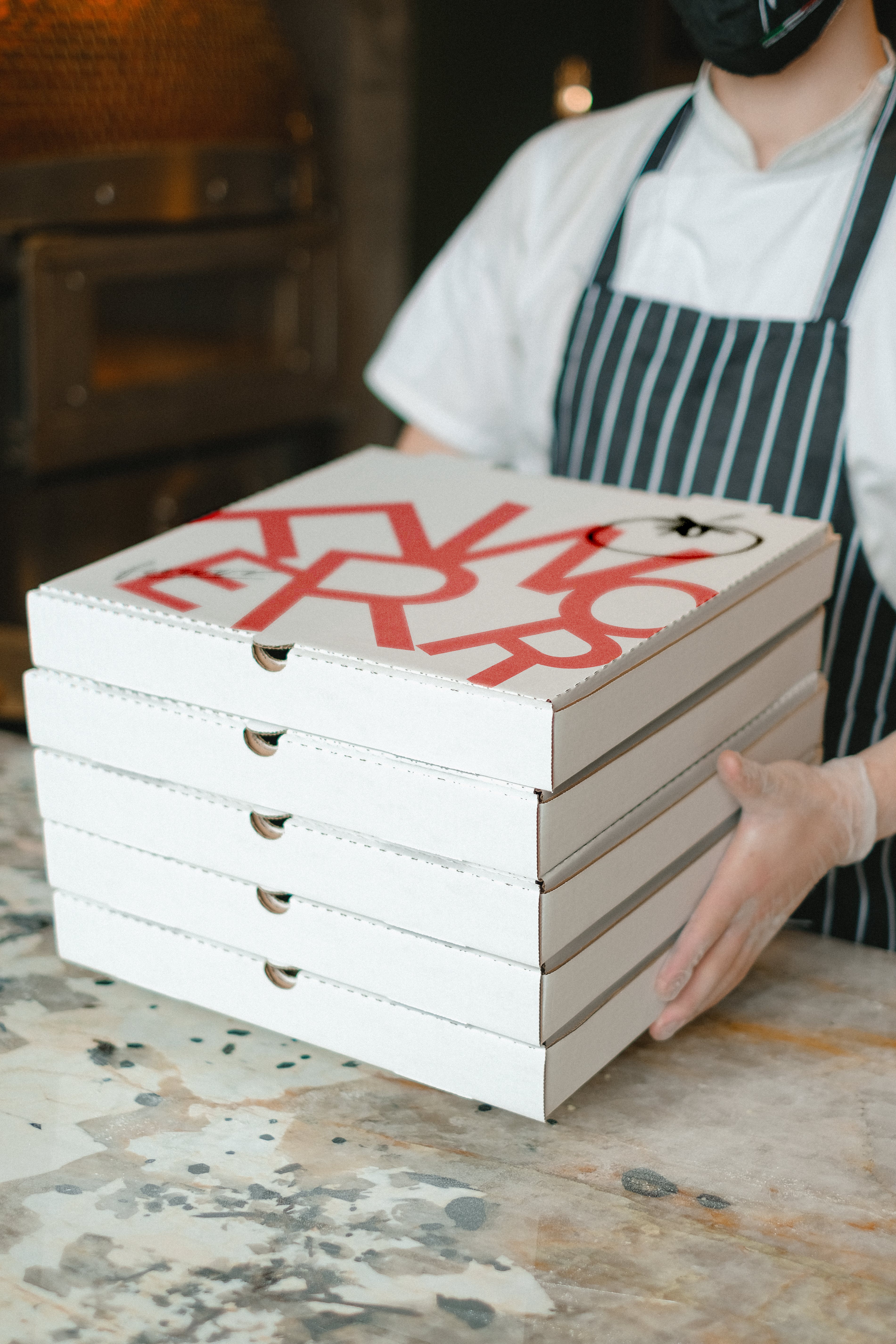
Ferwor is born from a personal passion for pizza-making, turning a love for the craft into a platform for celebrating togetherness. Through workshops and events, we create unforgettable experiences, uniting people over the shared joy of authentic Neapolitan pizza.
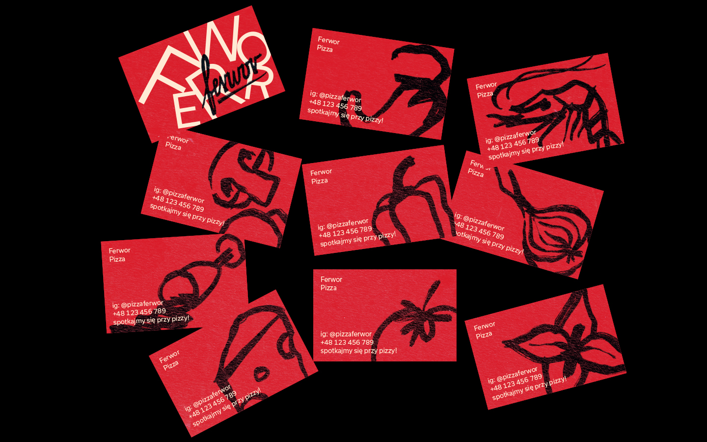
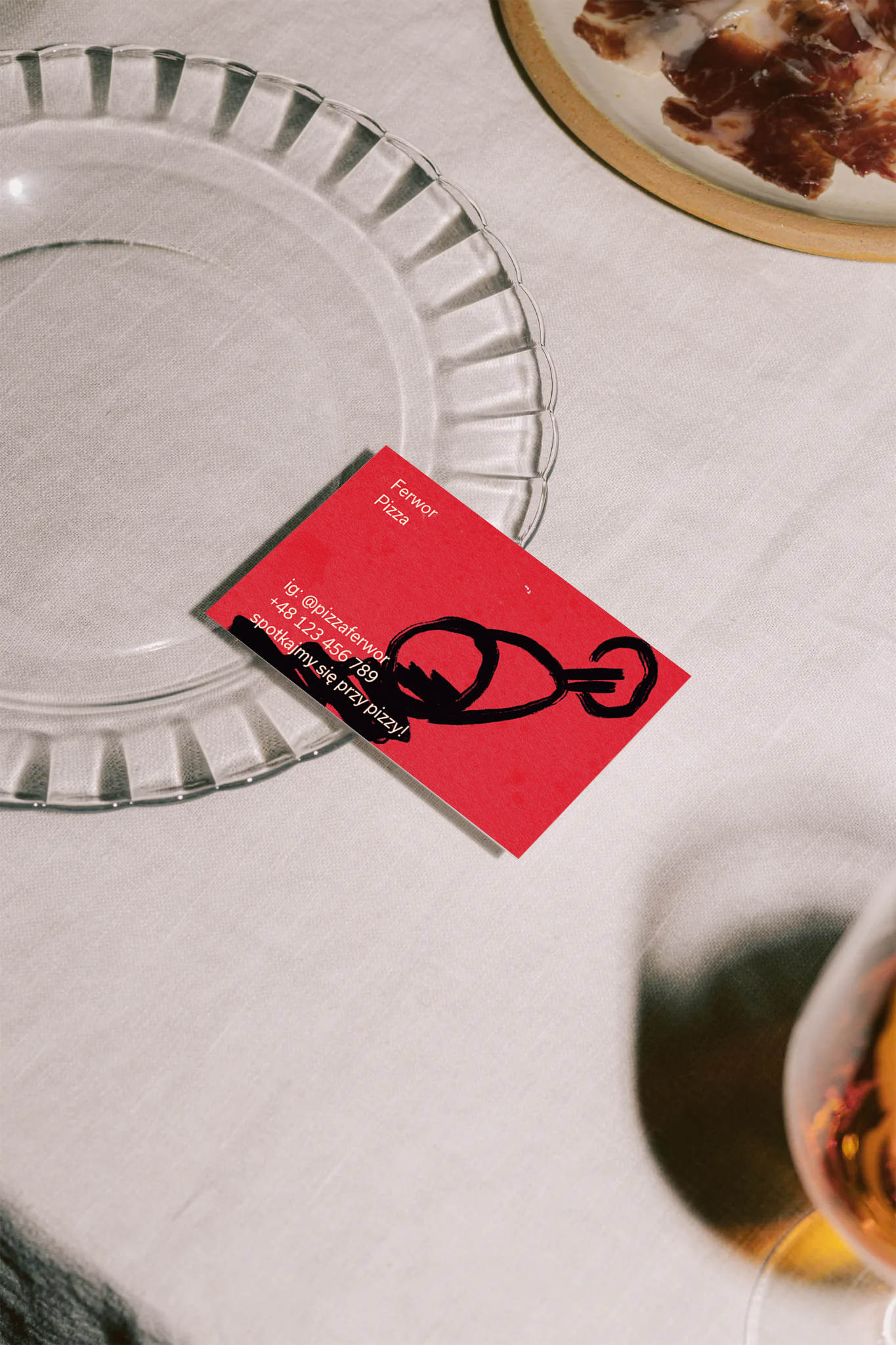
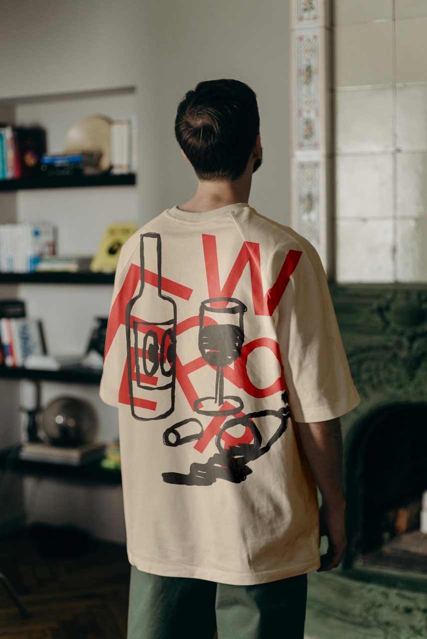
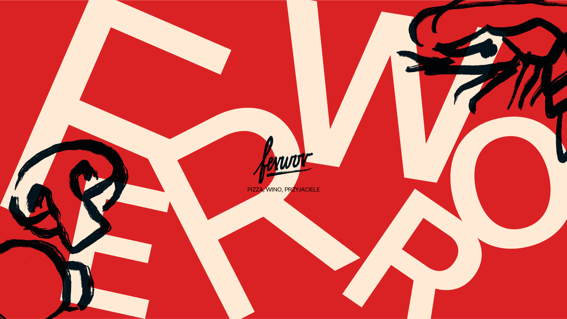
The visual identity reflects the lively spirit of pizza gatherings, with playful typography scattered like mozzarella on a vibrant tomato sauce and hand-drawn illustrations emphasizing the artisanal, hands-on nature of the craft. At its core is the Ferwor logotype—a bold signature of the passion and dedication behind every creation.
The color palette draws directly from the essence of pizza: fiery tomato red, creamy off-white tinged with Neapolitan yellow, and charred black, evoking the authenticity of a wood-fired oven. An elegant grotesque typeface complements the hand-drawn elements, striking a perfect balance between structured sophistication and raw, creative energy.
This project emerged from personal initiative and a genuine love for making pizza. Ferwor isn’t just about events—it’s a celebration of flavors, fun, and the fiery passion of bringing people together over a timeless culinary tradition.