The brand "Jacek i Zębatka" taps into a nostalgic, uniquely Polish vibe with its name, referencing the beloved 1960s children’s show "Jacek i Agatka", which many remember fondly. This nod to Poland’s past creates an immediate sense of warmth and familiarity, grounding the brand in local culture and history.
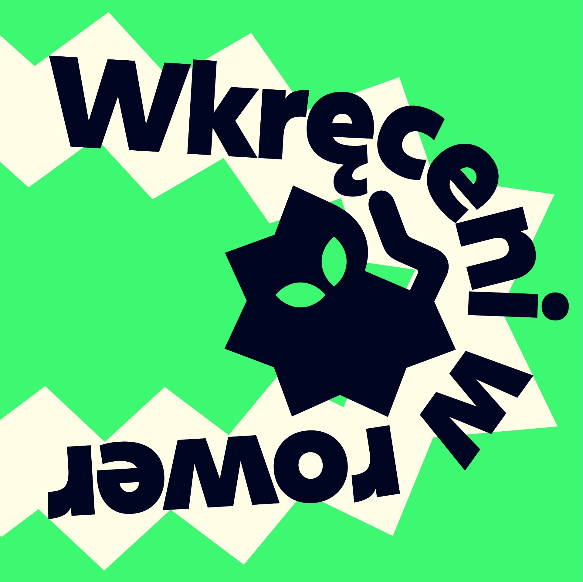
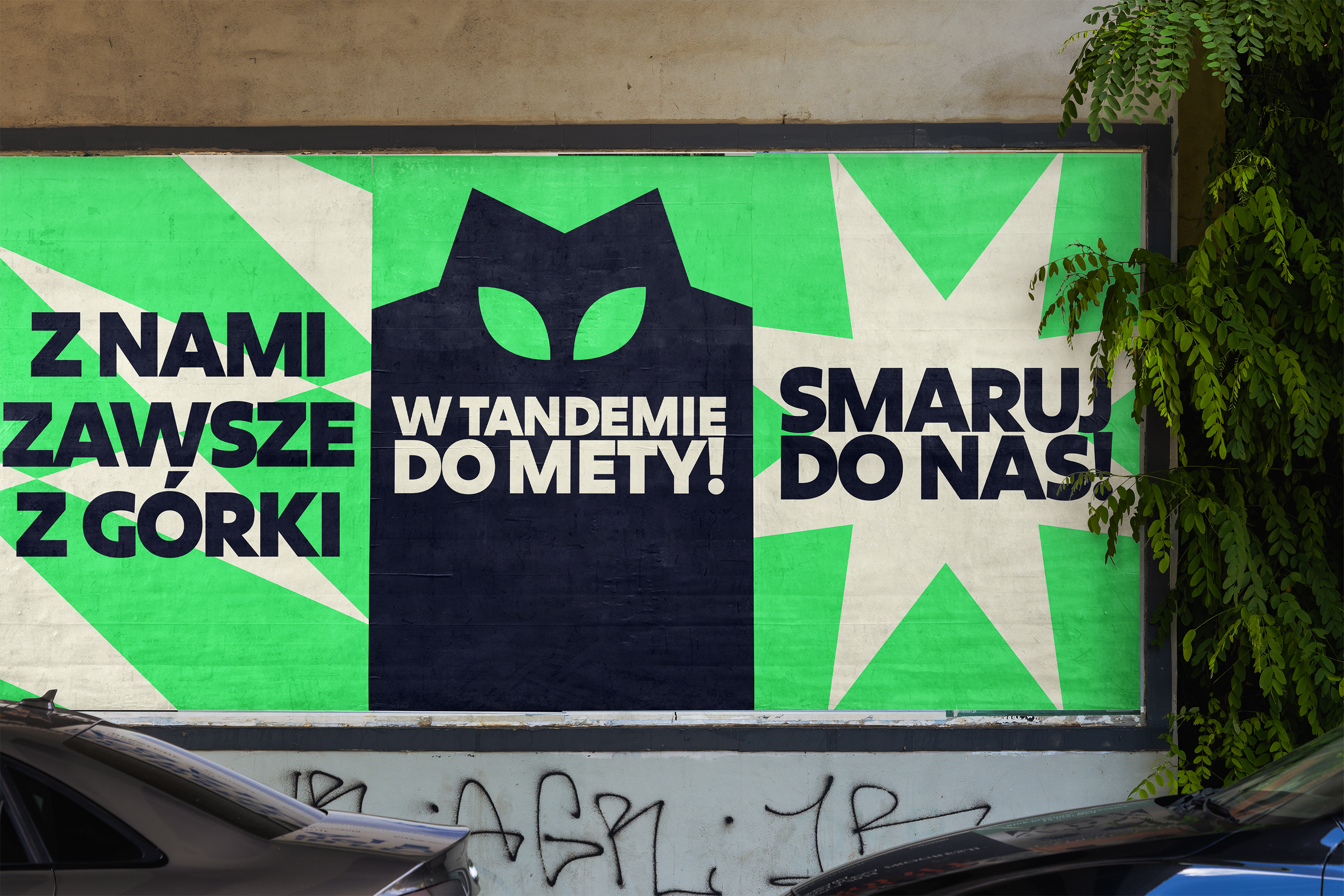
Visually, the concept is brought to life with a logo featuring a mysterious and elegant cat—a sleek figure resembling a bicycle gear and reminiscent of classic characters like cat Bonifacy from "Kot Filemon" show. This choice of animal as a symbol isn’t just whimsical; it’s also part of a broader tradition in Polish bicycle culture. The well–known “Romet” brand, for example, used animal imagery in its branding, making this logo a fitting homage to Poland’s cycling and graphic design legacy. The logo’s enigmatic cat embodies agility and quiet strength, qualities that riders seek in a well-crafted bicycle. The brand's signature neon green is inspired by the way a cat’s eyes shine in the dark. This vivid, reflective hue isn’t just striking—it’s designed to keep riders visible and safe on the road, no matter where they go.
Finally, the brand celebrates a sense of community and freedom. This cat isn’t just a logo—it’s a symbol of resilience and independence. With Jacek i Zębatka, cycling becomes more than a journey; it’s an adventure shared with a lucky, sleek companion by your side.